Taking your PDF files mobile with Acrobat X
By Donna Baker – August 26, 2011 Donna Baker
Mobile apps are all the rage nowadays. And no wonder—there are literally millions of users hungry for apps of all sorts. If your business or organization plans to get on the mobile bandwagon, why not reuse your existing content?
Whether you have PowerPoint presentations, training manuals or maps, you can reformat and repurpose your material suitable for viewing on smaller screens.That way, you can easily provide users with your content as part of your mobile marketing strategy.
Note: In the examples in this article I'm using a 10-inch, Android-based tablet.
The case for the lowly PDF file
Let's face it: a PDF file isn't a sexy app. On the other hand, we know how it works, and that it does work.
Consider these points on using PDF as the basis for your mobile content:
- PDF files are ubiquitous. All Android devices can run Adobe Reader X Mobile (or other apps) and usually include an application that reads PDF files. What you're used to viewing on your computer or laptop is also making the transition to tablets and smartphones.
- PDF files are easy on your device's batteries, as viewing a PDF file is a low-energy activity. So, for example, a PDF map of a neighborhood showing the properties you have for sale uses far less power than linking to an online site running a mapping app, or running a GPS app. Your clients can view the property, and have enough battery life left to make the calls to close the deal.
- PDF content is easy to share and download. Share content via email or by simple downloads from your traditional website. Once downloaded, your users can access your latest tutorials or newsletters, whether or not they have Internet access.
- PDF documents are easier to design for uniform display. It's harder to write an app or design a web page that looks the same on an iPad or Android tablet, as well as an iPhone or smartphone than it is to use a PDF file. With some considerations for the page layouts and structure, your PDF files can look very similar regardless of the device used.
- PDF documents view reliably. Some other file formats, such as .doc or .ppt, don't render properly. Word documents often show problems with spacing and fonts, while PowerPoint slides may hide complex graphics and images altogether. Convert the files to PDF for reliable viewing, a smaller file size and easier navigation.
- PDF documents are low-cost options. If your user wants reliable information, do you really need the cost of developing a resource-intensive app?
Design considerations
Let's assume you want to put some customer materials online, and you want customers to readily view the content on a smartphone or tablet. Even though Wi-Fi is becoming faster, less expensive and more accessible, make sure to optimize files designed for mobile viewing.
When you're planning to reuse your PDF content for mobile consumption, keep these two basic design features in mind:
Content density: A mobile device screen shows up to 80 percent less content per single screen that what you see on a conventional computer screen (Figure 1). With the greatly reduced density, your users may have to zoom in or navigate left or right when trying to view a file originally used on a computer monitor.
Figure 1: A mobile screen shows only a fraction of a conventional page.
Horizontal scrolling: The problem with horizontal scrolling, of course, is that the scrolling actions are easily confused with the device's navigation and takes you to the page prior or following the displayed page. Arrange your content in a single-column layout. Your readers can scroll vertically without any problems.
Tip: If you're using a PDF file in Acrobat Reader X Mobile, you won't have an issue with horizontal scrolling, as the content wraps automatically.
Page layouts
Although there aren't any requirements for your page layouts, you can optimize how your files are presented depending on the nature of your content.
If you are presenting information in small chunks, consider using a 4:3-ratio template in your program of choice before converting to PDF. You'll be able to show your content at a full-screen size on many devices.
Figure 2: Use a common ratio for easier full-page viewing.
On the other hand, if your content flows as a multi-page document, present your file in multiple scrollable pages. Taking into account the characteristics of mobile reading, you might prefer to use several topical documents assembled into a PDF Portfolio rather than one long document (Figure 3). For ease of reference, add a descriptive Display Name when assembling your PDF Portfolio. Your readers aren't likely sitting still for an hour scrolling through screens as they may do at work or at home.
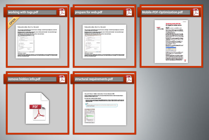
Figure 3: Break up a long document into easily consumable segments.
Note: The Acrobat X PDF Portfolio interface is shown in Figure 3, not as the PDF Portfolio appears in Adobe Reader X Mobile.
Handling images and other page objects
Images present a challenge. Consider their value before adding or leaving them in your PDF files. Where you do need to use images, make sure to use an online format, such as jpg, png or gif, and check the resolutions for the images as well. Your users won't appreciate the overhead of 1200-dpi images when they're only able to view a fraction of that image data!
Whenever reasonable, use a large portion of the screen or the whole screen for graphics, especially labeled graphics (Figure 4). Make the graphic large enough to see at a full-page size, and let your users decide whether to zoom in for a closer view.
Figure 4: Place graphics logically.
Some images you may be accustomed to using in documents or PDF files viewed on a monitor don't make the conversion to mobile use very well. Here are two examples.
Inline graphics don't display consistently. As you see in Figure 5, the appropriate icons should flow with the text. When viewed in Adobe Reader X Mobile in Continuous Scroll mode, the images cause breaks in the flow of the text and spacing issues.

Figure 5: Inline graphics don't display properly.
Anchored objects don't behave as a single object in either the Continuous Scroll mode or Reflow view. Figure 6 shows the page layout in Fit-to-Screen mode. Notice the two Note objects. The upper one on the page is a screenshot placed on the page as a .png file. The lower Note object is a basic anchored object made up of the small graphic, the heading Note..., the colored frame, and the text within the frame.
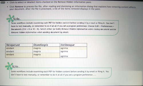
Figure 6: Basic page layout.
Notice what happens when the page view changes. In Figure 7, when I change to the Continuous Scroll mode, the top object looks the same as it's a basic image. However, the lower object breaks down into its components, which are listed on the page. Combining the objects into a <div> tag or grouping them in InDesign didn't make any difference in how they displayed in Adobe Reader X Mobile.
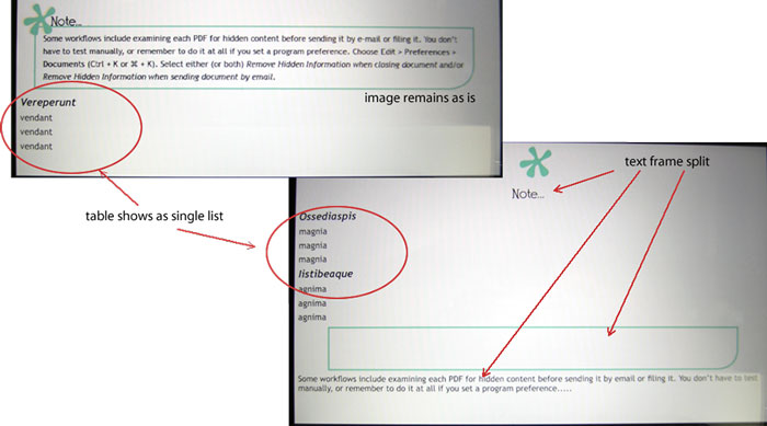
Figure 7: Anchored objects break down.
Tables are another common page element. Figure 6 shows a simple, three-column table with alternating background colors, and two merged cells. When viewed in a mobile format, the table reformats as a single list without any fills or strokes (shown in Figure 7). Simplifying the table didn't make any improvements. However, just as with the anchored object, a screen capture of the table inserted as an image shows as intended.
Structural considerations
There are two structural areas to look at when designing your PDF files for mobile use—document properties and tags.
You don't need a lot of document information to make your content much more usable by search engines. At a minimum, include a Title, Author, Subject, and Keywords (Figure 8).
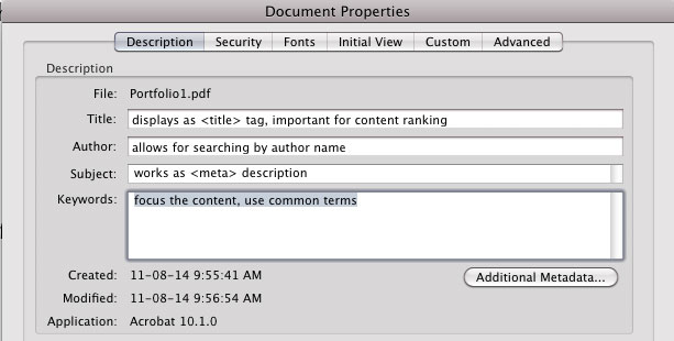
Figure 8: Add basic metadata to your files.
Make sure to include tags in all your PDF files used for mobile use. The tags help your viewer display the content correctly, particularly when using a Reflow Text view or when you are zoomed into the page.
I did several experiments to see how the output would look in Adobe Reader X depending on whether I exported a tagged file from InDesign, or whether I exported a file from Word or InDesign and then tagged it in Acrobat X. Interestingly, although the tagging structure uses different tags, the outcome was generally satisfactory (Figure 9).
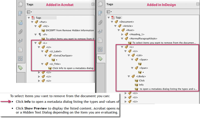
Figure 9: Be sure to tag the files.
In the figure, you see the Tags panel for the document tagged in Acrobat at the left and the same file using tags imported from InDesign. The applicable page content shows in the overlying text at the bottom. Tagging the document in Acrobat X did ignore bold text that should have been defined as a as in the InDesign tagged PDF.
A final note on tagging: Some of your users may read your content with images turned off. Be sure to include text tags for your images.