This tutorial shows you how to work with the JavaScript features in Acrobat 9. See what the all-new Acrobat DC can do for you.
Download a free trial of the new Acrobat.
How to make a toggle button in Acrobat 9
Learn the technique for creating a toggle button using Acrobat 9 and Acrobat JavaScript.
By Thom Parker – October 29, 2009


Normal PDF buttons have no state. The user pushes the button to make something happen. The button always looks the same, and every time the user pushes the button, the same thing happens. A toggle is a button with state. When the user pushes it, the button stays pushed in. When pushed a second time, it pops back up. And, of course, different things happen when the button is in the different states -- up or down -- usually turning something on or off. Toggle buttons are useful for a form, or for a document that has different modes of operation. For example, a form may have an optional or official use area. A toggle button can be used to enable and disable this area for data entry. Another handy application is for an internal-use document with an extraordinary load of calculations, such as a data-analysis form. On this type of form the calculations can cause a major performance impact while the user is entering data. It is therefore very useful to turn off calculations until entry is complete. The toggle button gives the user an easy-to-understand visual indication as to whether calculations are on or off.
In concept, a toggle button is very much like a checkbox. The difference is in usage and the subtle visual queues given to the user. A checkbox is a data element. While it can be used as a form control, it’s typically used for entering data on the form, whereas a toggle button is not a data element. It is used solely to alter form behavior and does not contribute directly to the form data. The toggle button is a very handy control to have in our form design toolbox. Unfortunately, it is not provided as a native control in either AcroForms or LiveCycle Forms. In both forms technologies, this feature is created through scripting. In this article, we’ll cover the details for implementing a Toggle Button in both AcroForms and LiveCycle Forms.
The general technique
Regardless of the forms technology, AcroForms or LiveCycle, the technique for creating a Toggle Button is identical. Only the technology-specific details are different. To start with, both forms technologies have button styles for sunken and raised borders. We’ll use this style not only to provide the appearance of a pushed-down or popped-up button, but also as the logical state of the button. The action a button performs is typically activated on the Mouse Up trigger, so we’ll use this event in both technologies to change the border style and perform the state-specific action. That’s really all there is to it. Just to make it clearer, here’s the pseudo-code, run from the Mouse Up trigger that describes our general technique:
if(button.borderStyle == RAISED){
    button.borderStyle = LOWERED;
    //Modify Other Button Properties for Pushed Look
    //Perform Button Push Action
} else {
    button.borderStyle = RAISED;
    //Modify/Restore Other Button Properties for Popped Look
    //Perform Button Pop Action
}
Notice in this pseudo-code there is a placeholder for modifying other button properties. Depending on the quality of the up and down button borders, other properties may need modification to enhance the effect. For example, since the up and down actions are different, it’s useful to change the button’s label. Changing border and fill colors can also help to set off the button’s appearance. AcroForms has the ability to dynamically switch out images for the button appearance so it’s the most flexible and customizable technology when it comes creating a visual Up/Down button effect. The quality of the appearance is entirely subjective, so you’ll have to decide for yourself what changes are best. Be sure to test out several ideas before publishing your form.
AcroForms specifics
In this example, we’ll create a Toggle Button that turns form calculations on and off. You can download a minimal example here: AcroForm_BasicToggle.pdf. This sample provides only the basic code needed to create a toggle button. Another sample that uses two toggle buttons on a real form can be downloaded here: AcroForm_ToggleButton_Sample.pdf. The buttons in this real world example modify the overall form behavior and are slightly more complex than the basic sample. These are very good examples of how a simple toggle value can be used to modify complex behavior on a form.
The setup
So to begin, open a sample PDF file. This can be a form you are already working on, or a new blank PDF for testing the idea. Add a button to the form. The button should initially display in the Up position so set up the Button appearance properties as follows (Figure 1 and Figure 2):
- On the "Appearance" Tab
- "Thick" Line Thickness
- "Beveled" Line Style
- Choose the Border, Fill, and Text Colors to match the color scheme on the form.
- On the "Options" Tab
- Set the button Layout to "Label" Only
- Set the Behavior to "Invert"
- Enter a Label that describes the action that will take place when the button is pushed into the down position.
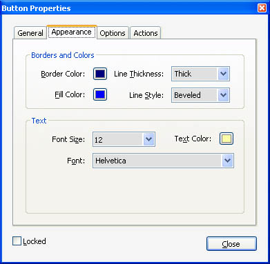
Figure 1- Initial appearance properties for toggle button
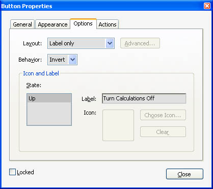
Figure 2 – Initial option properties for toggle button
The code:
All that is necessary to complete the Toggle button is to fill in the pseudo-code with the matching AcroForm code. Within a script on a field, the field itself is always referenced with the "event.target", so this replaces the word "button" in the pseudo-code. The property border style property is "borderStyle" and it takes on the values of some constants that are predefined in Acrobat JavaScript. The two we are interested in are "border.b" (beveled or raised) and "border.i" (inset or lowered). So the first translation of the pseudo-code becomes:
if(event.target.borderStyle == border.b) {
	// Perform Push Down Actions
	event.target.borderStyle = border.i;
	event.target.buttonSetCaption("Turn Calculations On");
	// Darken Down Colors
	event.target.textColor = ["RGB", 0.8, 0.8, 0.4];
	event.target.fillColor = ["RGB", 0, 0, 0.7];
	// Turn Calculations Off
	this.calculate = false;
} else {
	// Perform Pop Up Actions
	event.target.borderStyle = border.b;
	event.target.buttonSetCaption("Turn Calculations Off");
	// Restore Up Colors
	event.target.textColor = ["RGB", 1, 1, 2/3];
	event.target.fillColor = ["RGB", 0, 0, 1];
	// Turn Calculations On
	this.calculate = true;
	this.calculateNow();
}
This is all that is necessary to perform the basic Toggle Button behavior. But to make it useful, we need to add the action. In this case, we’ll turn calculations on and off with the "doc.calculation" property. In addition, we are also going to add code to modify the button’s label and darken it when it’s pushed to enhance the button’s appearance. Here is the final code, entered into the MouseUp Action:
if(event.target.borderStyle == border.b){
	// Perform Push Down Actions
	event.target.borderStyle = border.i;
	event.target.buttonSetCaption("Turn Calculations On");
	// Darken Down Colors
	event.target.textColor = ["RGB", 0.8, 0.8, 0.4];
	event.target.fillColor = ["RGB", 0, 0, 0.7];
	// Turn Calculations Off
	this.calculate = false;
}else{
	// Perform Pop Up Actions
	event.target.borderStyle = border.b;
	event.target.buttonSetCaption("Turn Calculations Off");
	// Restore Up Colors
	event.target.textColor = ["RGB", 1, 1, 2/3];
	event.target.fillColor = ["RGB", 0, 0, 1];
	// Turn Calculations On
	this.calculate = true;
	this.calculateNow();
}
It’s important to note that the action performed-- in this case changing the "calculate" property -- may be performed in more than one script on the form. And, in fact, that’s exactly the case for the sample file provided in this article. To properly handle this type of situation, the Toggle Button must be considered the Master setting and all other scripts defer to it. In the sample file, this is implemented through a document-level variable that the other scripts use to modify their behavior.
It’s actually quite simple to create a basic toggle button. The hardest part is finding the property values we need to make the button look right. If you have a button image design, then advanced users can experiment with the "field.buttonSetIcon() " function, which loads an image as the button’s appearance. In this case, the Button Layout Property in the Options should be set to "Icon Only" and the border and fill colors should be set to None.
LiveCycle specifics
While LiveCycle forms are structurally very different from AcroForms, button properties and behavior are practically identical. In the following code, we’ll create the exact same button used in the AcroForm example, except this one will show and hide a subform.
The complete sample is here: AcroXFA_BasicToggle.pdf.
The Setup
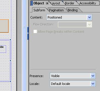
To build our LiveCycle example, start up LiveCycle Designer and create a new document. Add a regular button and a subform to the form. For the example, it doesn’t matter how they are placed. Set the caption on the button to "Button Up" and add some visible elements to the subform just so there is something in it. A static text element is fine. The default properties for both elements should work, but to be sure, each should have the following properties (Figure 3 and Figure 4):
- Button properties
- Caption: "Button Up"
- Appearance: "Raised Border"
- Highlighting: "Push"
- Control Type: "Regular"
- Subform properties
- Content: "Positioned"
- Presence "Visible"
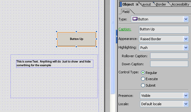
Figure 3 – Toggle button test setup and initial properties for button
The last thing required to make this work is to set the PDF so it automatically saves non-data changes in the form. Normally, an XFA form only saves the data.
To do this (Figure 5):
- Open the form properties dialog from the "File > Form Properties…" menu item.
- Select the "Defaults" tab.
- Under "Preserve Scripting Changes to Form When Saved" Select "Automatically."
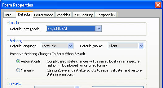
Figure 5 – Set form to automatically save non-data changes
The code:
To enter the code, select the button and open up the "Script Editor." If the "Script Editor" is not already visible, it can be activated from the "Window > Script Editor" menu item. We’ll enter two scripts, an Initialization Script and a MouseUp Script. The Initialization Script is used to increase the button’s border width. This is necessary because the LiveCycle user interface doesn’t allow the border width to be modified when the appearance is "raised." The increased width enhances the pushed and popped affect.
So to start out, select "Initialization" event from the "Show" pulldown and enter this code:
Initialization code:
this.borderWidth = "3pt"
In the LiveCycle Scripting Model, the keyword "this" is a reference to the object containing the script, which in this case is the button.
Next, we’ll enter the MouseUp script. The only difference between this code and the code used on the AcroForm Toggle Button is the specific property names. Otherwise, the structure of the code is identical.
MouseUp code:
if(this.border.edge.stroke == "raised"){
	// Button is Up, Perform Push Down Actions
	// Set Button Caption First so it will update properly
	this.caption.value.text.value = "Button Down";
	// Set border to appear pushed in
	this.border.edge.stroke = "lowered";
	// Darken background to enhance pushed in effect
	this.fillColor = "175, 175, 175"
	Subform1.presence = "hidden";
}else{
	// Button is Down, Perform Pop Up Actions
	this.caption.value.text.value = "Button Up";
	// Set border to appear popped up
	this.border.edge.stroke = "raised";
	// Restore background color
	this.fillColor = "212, 208, 200"
	// Pop Up Action - Show Subform
	Subform1.presence = "visible";
}
The first thing to notice is that in LiveCycle, we have to drill down a couple levels to get to the border style property, called the "stroke." It takes a text value, and the two values we are interested in are "raised" and "lowered," which provide the popped up and pushed down appearance and are also used to maintain the state of the button.
Within the "if" block, the first value modified is the button caption. Unfortunately, modifying this parameter does not necessarily cause Acrobat to refresh the view. But some of the following modifications do cause a redraw, so the caption is modified first to take advantage of these other operations. The next two operations change the button’s up/down appearance. And finally, the button action is performed. In this case, we are simply showing and hiding the subform by switching the presence property between "visible" and "hidden."
That is all there is to creating a Toggle Button.
Products covered: |
Acrobat 9 |
Related topics: |
PDF Forms, JavaScript |
Top Searches: |
Convert existing forms to fillable PDFs fill and sign PDF onlineEdit PDF create PDF Action Wizard |
Try Acrobat DC
Get started >
Learn how to
edit PDF.
Ask the Community
Post, discuss and be part of the Acrobat community.
Join now >
2 comments
Comments for this tutorial are now closed.
Thom Parker
6, 2012-07-23 23, 2012If a field is truly “hidden” it does not receive mouse clicks. But the same technique outlined in this article can be used to set all of the field visual properties to transparent. That way the button is still there and gets mouse clicks.
However, this is not really the best technique because users don’t know an invisible button is really there. If you want to toggle the visibility of a field, you need to figure out how you want to trigger it.
If you need more assistance, please post to the regular forum.
Robert Wilkins
8, 2012-07-17 17, 2012how about if I want it to toggle visibility of hidden field?
Comments for this tutorial are now closed.